
Zacks Mobile App
While working for Zacks Investment, I took on the task of re-designing the existing mobile app from scratch. The previous version hadn’t been updated in a few years, and was in poor condition, with very low ratings in the app store. I was the only designer handling the entire UI/UX process. I worked directly with the development team for the company to have it built out, and released for both Android and iOS.

My initial process began with evaluating the existing app. I wanted to see what worked, what needed improvement, and what was missing. I also ran user testing on the existing app to determine some of these parameters. This helped me to find out what features users wanted added, and how they were using similar apps to replace the missing features they needed in this app.
I also began with initial paper and pen sketches for wireframing. This helped me to really figure out what we needed to add, and what information needed to be included in the app, early on. The biggest issue with this app is that it was very data heavy. They provide a massive amount of stock data, and it was important to figure out how to organize it as to not overwhelm the user. It was also important to nail down navigation because of this issue.

Since this was an existing app, with some loose existing branding, I had to work within what I was given, while improving and tweaking it. The brand color green and the orange highlight already existed, so I built out additional variations to work with. I also had to update all iconography within the mobile app. I create a whole new set of icons, as well as making the sizing for number and letter icons consistent. These, plus the shape and colors for each level, were eventually also adopted into the Zacks website as well for consistency with the app.
Initial Wireframing
We went through 2 separate rounds for initial wireframing. I worked directly with a project manager, and we gathered feedback from the President and VP of the marketing team.
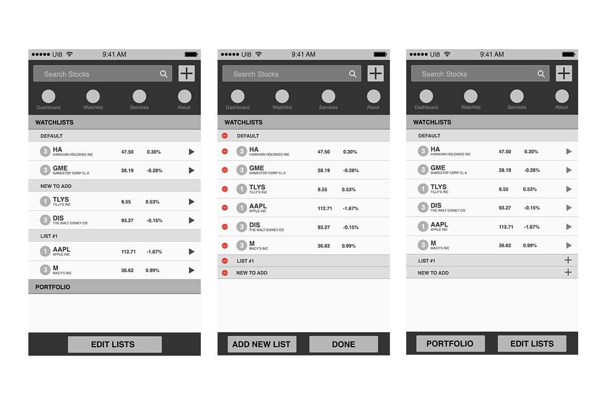


Design and Development Process
Once everything was approved, I created the final designs for the mobile app, and we moved into the development phase. The dev team had not created a mobile app previously, so it was a learning process as we worked together to build everything out. I spent about 3-4 months QA testing everything that was created, and working to ensure all the design elements were correctly rendered. I had to save out assets such as icons, create interactive files in Adobe Xd so they could get proper font sizes, colors, and sizing. Instead of creating a full prototype, the team opted to create a mirror version of the app that only I and the dev team could access, to make the QA process quicker. All changes were reflected in the actual released app throughout testing.
After everything was finalized, it was released for both Android and iOS. Previously it had only functioned on iOS, so the Android version was a new release. Within a few months, the overall rating of the app went from 2 stars to 4.6 stars in the iOS app store. The only concerns or errors reported were technical issues with data within the app.


