Minitab Website
Over the course of 6 years at Minitab, as the sole designer for the marketing and content team, I have created many webpage designs, for a range of products, landing pages, events, partner portals, and the Minitab blog. Much of what I created was built with the User Experience in mind, as well as being sure to properly incorporate our branding guidelines consistently. Mobile first is also very important to consider, so that the experience of viewing on a phone is also smooth and streamlined.
Case Studies pages
Problem: Case studies section of the website was difficult to navigate, poorly organized, and the actual case study pages themselves lacked hierarchy, branding, and readability.
Solution: Organized content into sections to make it easier to navigate and find info, added hierarchy and structure, and designed a new navigation with a tagging and search system.
Skills: UX/UI, Figma, Photoshop, AEM
Partner Portal
Problem: Minitab relies heavily on partners to sell in countries outside of the US, and they needed a portal to organize content and information, as well as give partners somewhere to contact Minitab directly.
Solution: Designing a portal with a clean, simple interface, making it easy for partners to find all the sales info they need. It also included branding materials, templates, and marketing materials.
Skills: UI/UX, Figma, Working directly with dev team
Results: Partners were able to sell with more efficiency, and branding standards became more consistent across all markets.
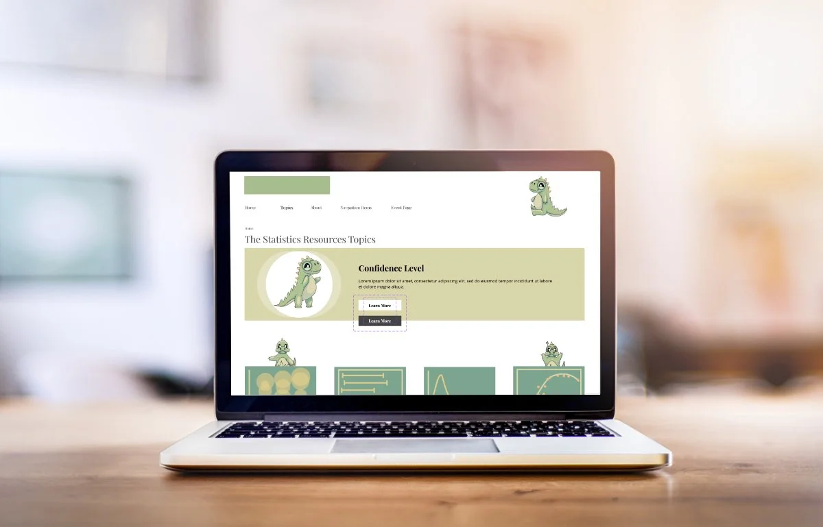
Datasaurus
This is a side project to create a site meant to educate on different Data and Analytics terms. I created an illustrated dinosaur as a kind of mascot for the site, which is incorporated across different pages. I also created a wireframe to guide the dev team in creating the site. I also designed cards for each of the words being defined on the site.


